

Instagram's text logo just got its first makeover in ten years, and reactions online have been about as mixed as you would expect from a change to something billions of people see every single day.
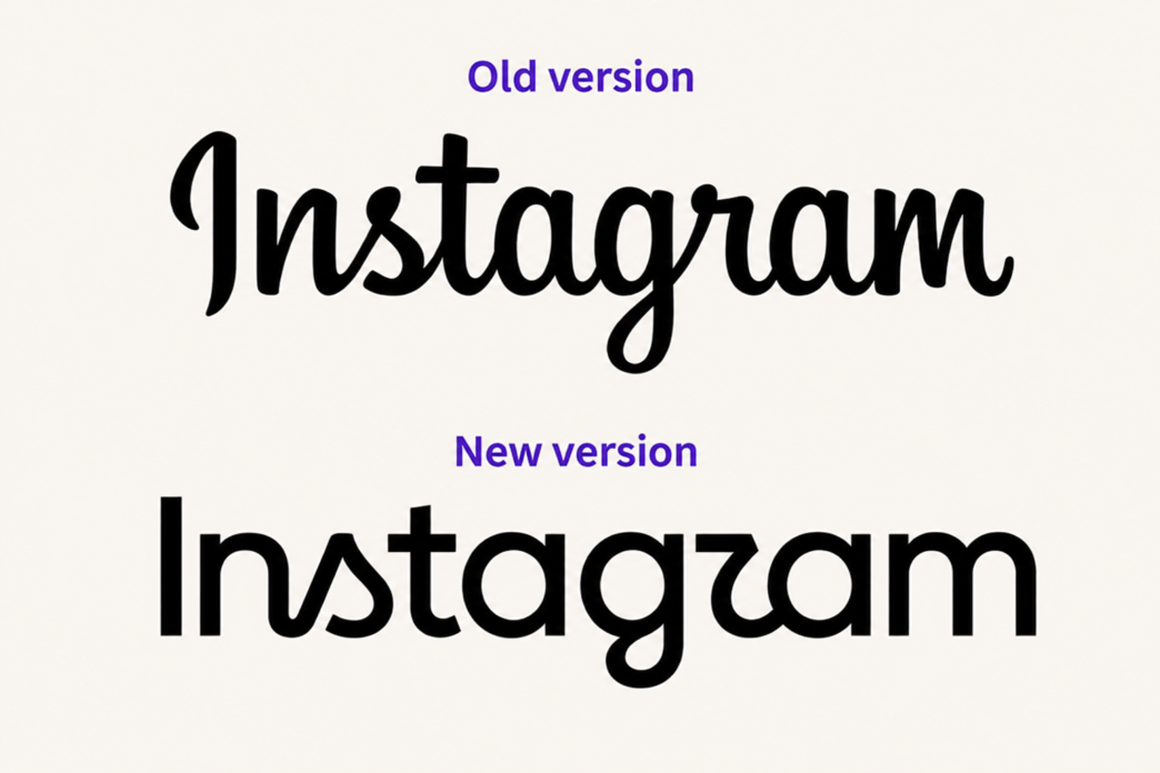
On Thursday, Instagram unveiled a redesigned wordmark, the text only logo that sits at the top of the app. It is the first change to that mark in a decade. Adam Mosseri, the head of Instagram, announced the update himself, explaining why the company decided it was time for a refresh.
"The wordmark at the top of the app hasn't changed in 10 years, so it was time for a refresh," Mosseri wrote. He described the new version as cleaner and more modern, while still carrying references to the original design and the simplicity and craft that has always defined Instagram's look.
The multicoloured gradient camera icon on your home screen is not going anywhere. What is changing is the lettering itself. The new wordmark swaps out the loose, handwritten cursive style from the 2016 version for a bolder, more compact script. It keeps the connected letterforms and the playful flourishes that made the original recognisable, just tightened up.
In a blog post explaining the process, Meta's design team said they explored hundreds of directions before settling on the final look. Ideas ranged from all caps treatments to concepts built around the camera icon to versions that leaned into literal handwriting. In the end, the team came back to script.
Jasmine Probst, director of product design at Instagram, explained the thinking behind that decision. "Script reflects individuality, so referencing that felt right," she said. "The new wordmark is bolder and simpler, with touches of unexpectedness."
The new wordmark is not a standalone change. It anchors a much bigger update to Instagram's overall brand system. The signature gradient is staying, but the company says it will be used more sparingly going forward, alongside refreshed motion design, layout choices and general interface updates.
Three typefaces now make up the broader visual language, an updated version of Instagram Sans, a new handwriting style called Instagram Pen, and a monospaced option called Instagram Mono. The updated wordmark is rolling out globally now, with the rest of the brand identity expected to follow through the remainder of 2026 and beyond.
As expected, the internet did not hold back once the new logo went live. Commenters on Mosseri's announcement quickly zeroed in on the stylised letter r, joking that the new wordmark now reads as Instagzam or Instagwam. Others pushed back on the jokes and said they liked the fresher look and the font choice.
Coverage from design publications was similarly split, ranging from routine reporting on the refresh to sharper criticism of the execution. It is a reminder that logo changes at this scale get tested by billions of eyes within hours of going live.
That scale is really the point here. Instagram crossed 3 billion monthly active users back in September 2025, joining Facebook and WhatsApp above that same threshold. Meta reported 3.48 billion daily active people across its full family of apps as of mid 2025. When a wordmark gets seen that many times a day, it stops being just a design asset and starts functioning more like public infrastructure, which explains why even a fairly conservative update generated this much conversation.
The redesign also fits into a larger pattern happening across Meta's apps. Fast Company noted that the new lettering's sans serif qualities bring Instagram's look visually closer to the wordmarks already used by Facebook and Threads. Threads rolled out its own updated visual identity back in May this year, following an earlier brand refresh at Facebook.
For marketers and brand builders watching from the outside, the real lesson here is less about the specific logo and more about the approach Instagram took. The team chose to evolve the design rather than overhaul it completely, holding onto the script, the warmth and the gradient that people already associate with the brand while modernising how it is executed.
In a period when rebrands often overcorrect and get walked back soon after launch, that restraint might end up being the most useful takeaway from the entire redesign.

Add a Comment